
Ølea
Project Type
Branding & Identity
Ølea is a sustainable craft beer brand inspired by Nordic purity and circular design. Every element — from naming to packaging — was crafted to create a holistic brand experience where nothing goes to waste.


Brand Concept
Ølea is a Nordic-inspired craft beer brand built on circularity. Every stage of the brewing process is designed with respect for nature: nothing is wasted, everything is transformed. From the grain to the glass, and even beyond the brewery, Ølea extends its purpose into natural skincare products, giving new life to what would otherwise be discarded.
The Challenge
The brewing industry generates significant organic waste during production. While craft beer celebrates authenticity, few brands address the sustainability behind their process.
The challenge was to design a brand that honors both craftsmanship and the planet — giving new life to what’s left behind.
The Concept
Ølea is built on the idea of circularity: what begins in nature returns to it.
After brewing, leftover ingredients are upcycled into natural skincare products, forming a complete ecosystem of creation, care, and renewal.
The name Ølea merges:
-
Olea (Latin) – “olive tree,” symbol of resilience, life, and tradition.
-
Ø (Nordic) – “island,” a nod to Scandinavian minimalism and purity.
-
Feminine resonance – representing nature’s nurturing and transformative power.
Design Approach
The design approach for Ølea merges functionality with emotion — translating the brand’s sustainable philosophy into a coherent and sensorial visual language.
Every element was designed to express balance, transformation, and the natural connection between craftsmanship and self-care.
Visual Identity
Ølea’s identity is built on a modular geometric system that bridges both the brewing and skincare worlds. Each element reflects balance, precision, and organic flow — a visual metaphor for sustainability and transformation.
The color palette draws from natural and ingredient-inspired tones: golden barley, fresh hops green, dark malt black, and soft clay neutrals. Together, they form a warm yet sophisticated aesthetic that connects the two product lines.
Typography combines Aileron Bold for its clean, geometric structure and EB Garamond SC for timeless refinement. This pairing mirrors the brand’s dual nature — modern craftsmanship meets natural tradition.
Simple geometric patterns — circles, hexagons, waves, and drops — serve as visual anchors across the identity. These shapes subtly reference ingredients, brewing textures, and natural forms, reinforcing consistency while allowing each product its own personality.
Packaging Design
The packaging reflects Ølea’s minimalist yet meaningful philosophy. Each beer label and care product uses the same visual DNA, translated through material and tone:
-
Beer Labels — Strong geometric contrasts and vibrant tones highlight the unique character of each brew (SOL, FJORD, MØRK, LYS, NORD).
-
Care Line — Softer palettes and delicate textures reinterpret the same patterns through a more natural lens, emphasizing purity and comfort.
Close-up details showcase the interplay between matte backgrounds, subtle gradients, and embossed geometric motifs — a tactile experience designed to feel as intentional and refined as the brand’s sustainable values.
Beer Line — Ølea Brewing

SOL – Larger
Bright yellow palette inspired by sunlight and golden barley fields.
Circular geometry symbolizes energy and warmth — the essence of brewing’s natural cycle.

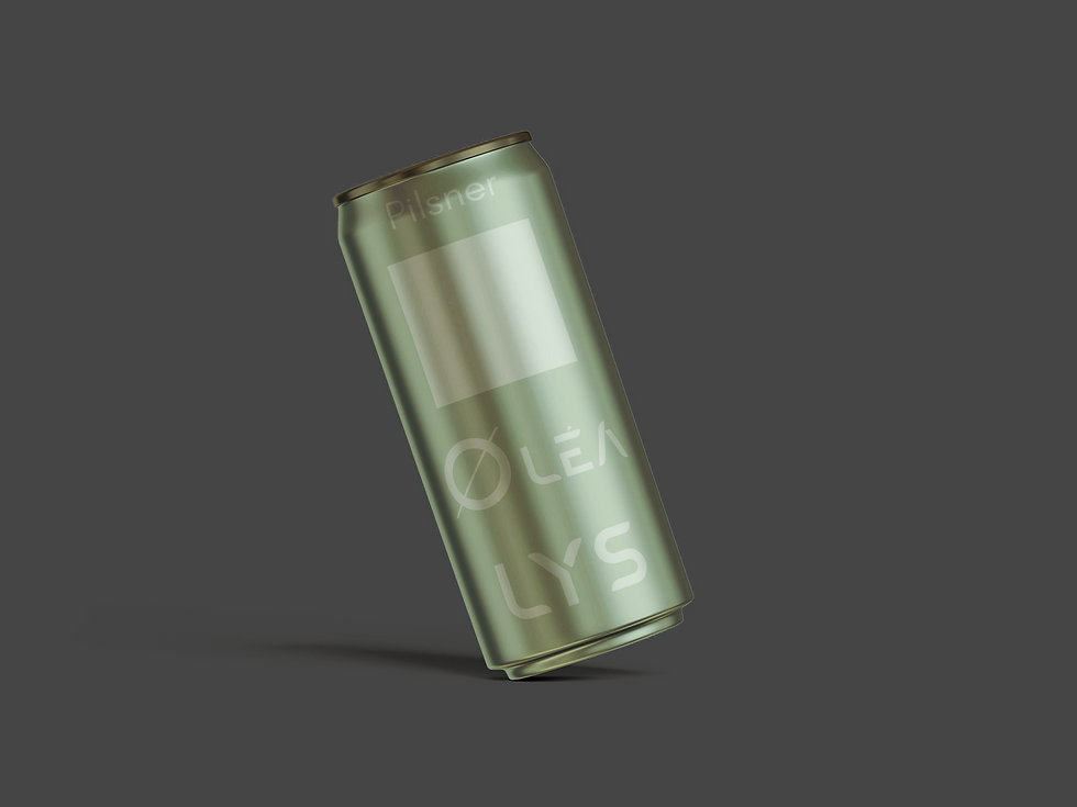
LYS – Pilsner
Soft greens inspired by hops and Nordic spring landscapes.
Subtle linework communicates lightness and freshness.

NORD – Seasonal
Pale blues and snowflake motifs celebrate Nordic winters and seasonal cycles.
Minimal geometry evokes calm, cold air, and natural clarity.
Care Line — Ølea Care

Hops Solid Shampoo
Fresh green color inspired by hop leaves and natural cleansing.
Organic droplet shapes suggest hydration and softness.

Calming Body Lotion
Soft neutral base conveys serenity and balance.
Decagon pattern symbolizes structure, harmony, and holistic restoration.

MØRK – Stout
Dark, contrasting tones reflect roasted malt and depth of flavor.
Hexagonal forms evoke structure and strength, grounding the visual system.

FJORD – IPA
Deep teal and wave patterns echo Norway’s fjords and flowing purity of water.
Clean geometric balance mirrors the crisp, refreshing taste of an IPA.

Brewer’s Yeast Face Mask
Rich amber palette reflects yeast and natural fermentation warmth.
Diagonal lines evoke skin renewal and flow of energy.

Barley Exfoliating Soap
Warm beige tones derived from barley grain hues.
Circular pattern echoes the beer bubbles, linking both product worlds.
Color & Material Harmony
Every label was designed to evoke tactile warmth and simplicity — matte surfaces, natural hues, and subtle contrasts between modern geometry and organic forms.
This visual balance reinforces Ølea’s essence: crafted with care, minimal waste, and maximum purpose.
Sustainability Loop
The project illustrates a circular design vision — where beer nourishes the body, and its by-products care for the skin.
Ølea closes the loop between enjoyment and self-care, inviting consumers to live more consciously, beautifully, and in rhythm with nature.